SkyLaunch just received a visual refresh—and this one came from the best kind of design review: brutally honest family feedback.
A big thank-you to my nephew Lucas, who didn’t hesitate to tell me that the previous interface felt a little… “old man.”
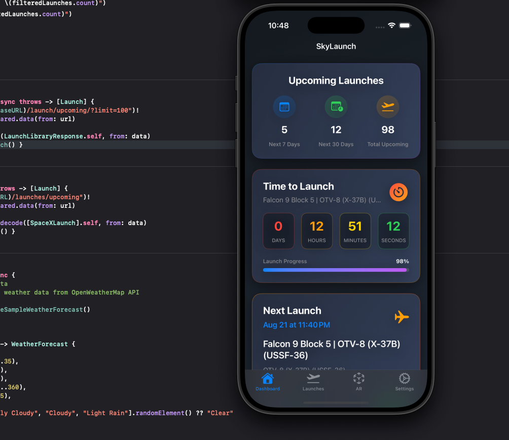
He was right, the original design prioritized readability and information density, but as SkyLaunch evolved, it became clear the UI needed to evolve with it. The new design shifts toward a lighter, cleaner, more modern aesthetic—one that feels at home on today’s devices while still keeping critical launch information front and center.
What Changed?
Refined typography with better hierarchy and less visual weight
Softer cards and spacing for improved scanability
Cleaner countdown elements that feel modern without sacrificing clarity
A brighter, more energetic feel that better matches the excitement of spaceflight
The goal wasn’t to make SkyLaunch flashy—it was to make it timeless, intuitive, and current.
Why It Matters?
SkyLaunch is an app you might glance at multiple times a day. Design matters not just for aesthetics, but for comfort, speed, and trust. If the interface feels dated, the experience feels dated—even if the data is cutting-edge.
Sometimes it takes a fresh set of eyes (and a younger generation) to push things in the right direction.
So thanks, Lucas—for helping SkyLaunch move out of the “Old Man UI” era and into something that feels more like the future it tracks.